· Vojtech Svoboda · Observability · 6 min read
Handling Azure Metrics
How to download and visualize metrics from Azure services and overcome Azure limitations

Exporting and Visualizing Azure Metric Data — My Experience
When I first tried to get a 3-month view of Azure metrics, I thought it would be as simple as opening the Azure portal and stretching the graph timeline. Spoiler: it’s not.
Azure, in its infinite wisdom (and for good performance reasons), will only let you see 30 days of data in a single graph. And even worse — it only stores 93 days by default (unless you’re pushing your data into a Log Analytics Workspace).
So, if you want a smooth, continuous graph that spans three months, you can’t just “scroll back”. You have to export the metrics yourself, stitch them together, and build your own visualization. That’s what I ended up doing, and here’s how.
Understanding Azure’s Limits
Before we get into commands and scripts, let’s look at what Azure will and won’t do for you.
- Retention period: Azure keeps metrics for 93 days by default.
- Portal graphs: You can only chart up to 30 days at a time.
- CLI export period: The maximum period you can export metrics through the Azure CLI is also 30 days at a time.
These limitations mean that any graph longer than a month will require exporting the data and working with it outside of Azure. Once you know this, the process becomes more of a “download, process, visualize” pipeline.
Talking to Azure CLI
The first step is getting the data out of Azure. For me, the Azure CLI is the easiest and most flexible tool for this job — it’s script-friendly, works across platforms, and is great for automation. To overcome the 30-day export limitation, you can loop this command to cover the entire period you need. By adjusting the start_time and end_time parameters in each iteration, you can sequentially export 30-day chunks of data until you have the complete dataset for your desired timeframe. This approach allows you to bypass the single-query restriction and gather a comprehensive view of your metrics over an extended period.
Here’s the base command you’ll use:
az monitor metrics list \
    --resource "$resource_id" \
    --metric "$metric_name" \
    --start-time "$start_time" \
    --end-time "$end_time" \
    --interval PT1H \
    --aggregation Total \
    --output json > "$output_file"
Detailed information about the CLI command can be found in the Azure documentation.
What Those Parameters Mean
Let’s explain all the variables for better understanding.
resource_id– The Azure Resource ID in full format. Example:/subscriptions/00000000-0000-0000-0000-000000000000/resourceGroups/myResourceGroup/providers/Microsoft.ContainerService/managedClusters/myClustermetric_name– The metric you want to export (e.g.,node_network_in_bytes). Each Azure service offers different metrics.start_time/end_time– Defines the time range inYYYY-MM-DDThh:mm:ssZformat. Max: 30 days per query.interval– Currently set to hourly (PT1H), but you can modify it to suit your requirements. For more details, refer to the Azure documentation on metrics aggregation.Output format – I use JSON (default) because it’s easy to work with in code, but Azure supports several formats.
Looking at the JSON Output
When you run that command, Azure hands you a JSON document with quite a bit of structure. It contains metadata, time intervals, and your actual metric values.
Here’s a trimmed example:
{
  "interval": "PT1H",
  "timespan": "2025-04-16T00:00:00Z/2025-05-15T23:59:59Z",
  "value": [
    {
      "displayDescription": "Network received bytes",
      "timeseries": [
        {
          "data": [
            { "timeStamp": "2025-04-16T00:00:00Z", "total": 11986356390.0 },
            ...
            { "timeStamp": "2025-04-16T01:00:00Z", "total": 8171367295.0 }
          ]
        }
      ],
      "unit": "Bytes"
    }
  ]
}
The key takeaway: your real numbers live under:
.value[].timeseries[].data[]That’s where we’ll look next.
Why Visualization is the Next Step
Now that you’ve got the numbers, the temptation might be to just open them in Excel and be done. But raw JSON (or even raw CSV) is tough on the eyes and even tougher for spotting trends.
A good graph turns these numbers into something intuitive. You can see spikes, patterns, and anomalies at a glance. That’s why my next step was plotting the data in Python.
Extracting the Data in Python
Before you can plot anything, you need to pull the relevant bits from the JSON and make them easier to work with. Here’s how I approached it:
with open(json_file, 'r') as f:
    data = json.load(f)

metrics_data = []
for datapoint in data['value'][0]['timeseries'][0]['data']:
    if 'timeStamp' in datapoint:
        timestamp = datetime.fromisoformat(
            datapoint['timeStamp'].replace('Z', '+00:00'))
        value = datapoint.get('total')

        # Convert bytes to GiB
        value_gb = value / (1024**3)

        metrics_data.append({
            'timestamp': timestamp,
            'value_gb': float(value_gb)
        })
In plain terms:
- Load the JSON file into Python.
- Loop through each datapoint.
- Convert from bytes to gibibytes (because numbers in the billions aren’t exactly friendly).
- Store them in a simple list of dictionaries.
Plotting the Data
With your data neatly structured, plotting becomes straightforward. I used Matplotlib and Pandas libraries, which are widely used within the Python community. Pandas makes sorting and organizing the data easy, and Matplotlib handles the plotting.
The following code snippets are part of the Python script we used, but let’s break them down for a better understanding of the process.
In the first snippet, we create the graph itself. We then load the data into Pandas DataFrames, primarily for easier data manipulation. In this example, we don’t manipulate the data much, only sorting it by timestamp in case Azure sends us an unsorted list. However, if we wanted to combine multiple time periods of data or perform any other data manipulation, DataFrames would make our task much easier.
For more information on these libraries, you can refer to the Matplotlib documentation and the Pandas documentation.
# Named imports
import pandas as pd
import matplotlib.pyplot as plt
import matplotlib.dates as mdates

# Create figure
fig, ax = plt.subplots(1, 1, figsize=(16, 8))

# Set title
fig.suptitle("Metrics graph", fontsize=16, fontweight='bold', y=0.95)

# Get data into dataframes and sort them
df = pd.DataFrame(metrics_data)
df = df.sort_values('timestamp')
# Plot line
ax.plot(df['timestamp'], df['value_gb'],
                color='#1f77b4',
                linewidth=2,
                alpha=0.9)
At this point, you’ve got a clean line with a shaded area underneath — already much more readable than JSON.
Making the Graph Readable
A good graph isn’t just about drawing a line — it’s about making sure the details are clear without clutter. The key takeaway from part is where I make the X axis labels adapt to the data range so the dates don’t pile up and become unreadable.
# Add subtle fill under the line
ax.fill_between(df['timestamp'], df['value_gb'],
                alpha=alpha_fill, color=fill_color)

# Clean, minimal styling
ax.set_xlabel('Time', fontsize=11)
ax.set_ylabel('Network Traffic (GB)', fontsize=11)

# Minimal grid
ax.grid(True, alpha=0.3, linestyle='-', linewidth=0.5)
ax.set_axisbelow(True)

# Format x-axis - adaptive based on data range
date_range = (df['timestamp'].max() - df['timestamp'].min()).days

if date_range <= 7:  # Week or less - daily ticks
    ax.xaxis.set_major_locator(mdates.DayLocator(interval=1))
    ax.xaxis.set_major_formatter(mdates.DateFormatter('%m/%d'))
elif date_range <= 31:  # Month or less - every few days
    ax.xaxis.set_major_locator(mdates.DayLocator(interval=3))
    ax.xaxis.set_major_formatter(mdates.DateFormatter('%m/%d'))
else:  # Longer periods - weekly
    ax.xaxis.set_major_locator(mdates.WeekdayLocator(interval=1))
    ax.xaxis.set_major_formatter(mdates.DateFormatter('%m/%d'))

plt.setp(ax.xaxis.get_majorticklabels(),
         rotation=45, fontsize=9, ha='right')

# Clean background
ax.set_facecolor('#ffffff')

# Plot padding adjustments
plt.tight_layout()
plt.subplots_adjust(top=0.9, bottom=0.15)
Saving the Graph
Once you’re happy with the look, save it as a PNG for sharing, reporting, or just keeping for your records.
output_file = os.path.join(output_dir, 'my_awesome_graph.png')
plt.savefig(output_file, dpi=300, bbox_inches='tight', facecolor='white')
plt.close()
Result
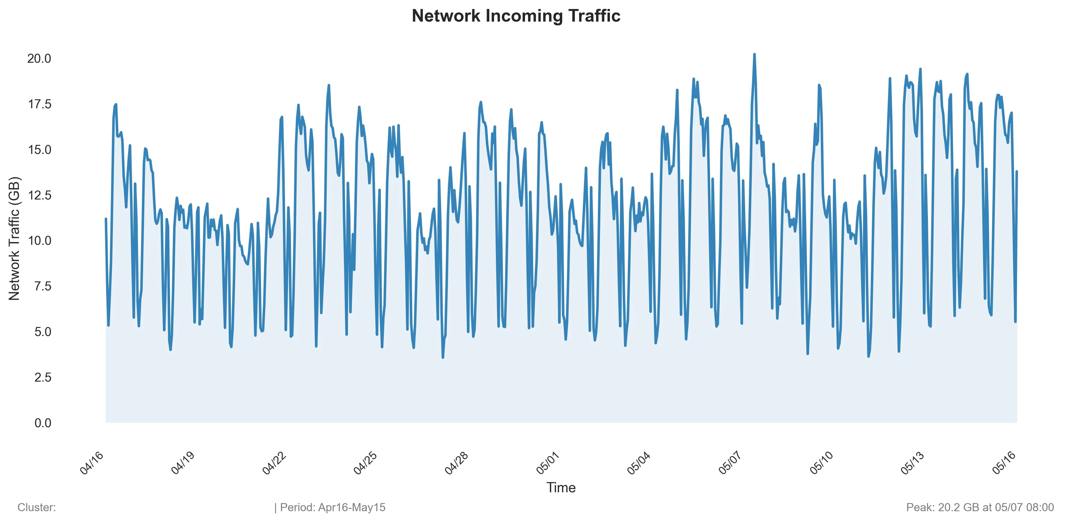
Finally, the resulting graph can look like this: 
Final Thoughts
This approach isn’t the fastest — you have to export, transform, and visualize — but the control it gives you is worth it (and for me personally, it is much faster than in Excel).
You’re no longer bound by Azure’s 30-day window. You can see the bigger picture, combine multiple months of data, and customize the graphs however you like.
And honestly, there’s something deeply satisfying about taking raw JSON straight from Azure and turning it into a beautiful, insightful visualization.